Walk through a bustling trade show or down a busy city street and one thing becomes immediately clear: not all banners are created equal. Some are forgettable, blending into the background, while others stop people in their tracks. What makes the difference? If you’re investing in custom banners Calgary, it pays to understand the design elements that transform a banner from ordinary to high-impact.
In this article, we’ll explore what defines an effective banner, the psychology behind visual engagement, and why even small design decisions can make or break your message.
1. Visual Hierarchy: Lead the Eye Where You Want It to Go
At its core, a banner is a visual communication tool. It needs to capture attention, convey a message, and encourage action — all within seconds. This is where visual hierarchy comes into play. Visual hierarchy is the arrangement of elements in a way that implies importance.
Use large, bold headlines to grab attention, followed by smaller subheadings and body text to provide more detail. The hierarchy helps guide the viewer’s eye naturally across the design. Color contrast, font size, and positioning all contribute to how well the viewer can process your message.
A common mistake is overloading the banner with text. Instead, opt for clarity: One headline, one supporting statement, and a clear call to action. Less is often more.
2. Color Psychology: Influence Mood and Behavior
Color is one of the most immediate ways to influence perception. Different colors evoke different emotions and reactions:
- Red communicates urgency or excitement
- Blue evokes trust and dependability
- Green is associated with growth and nature
- Black implies sophistication and elegance
Understanding your audience and your message helps you select the right color scheme. However, readability should never be compromised. Use high-contrast combinations (like dark text on a light background) to ensure your banner is legible from a distance.
Consistency with brand colors also matters. If your brand is known for specific hues, incorporate them strategically so viewers immediately recognize who you are.
3. Typography: Make It Legible and Impactful
Typography may not be the flashiest design element, but it is one of the most important. A beautifully designed banner means little if no one can read it. Choose fonts that are clean, bold, and easy to read from afar.
Avoid overly decorative or script fonts unless they serve a very specific, thematic purpose. Use a maximum of two font types to keep the design cohesive. Size matters as well — headlines should be large enough to read from several feet away.
Kerning, line spacing, and alignment also contribute to readability. Centered text can work for symmetrical designs, but left-aligned text is often easier to read quickly.
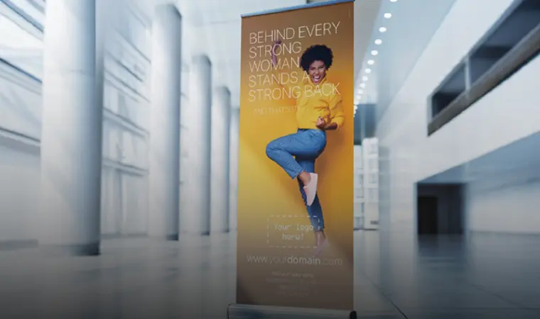
4. Imagery and Branding: Tell a Story Without Words
A compelling image can convey more than a paragraph of text. When choosing images for your banner, aim for high-resolution visuals that support your message or brand identity.
Lifestyle imagery, product photos, and even abstract graphics can all be effective, depending on the context. Just make sure they don’t distract from the core message.
Your logo should be present, but not overpowering. The banner is about communicating a message or enticing interest — not just reinforcing your brand. Balance is key.
Whitespace (or negative space) is also an unsung hero. It helps your design breathe, draws attention to important elements, and prevents the layout from feeling crowded.
5. Context and Placement: Design With Environment in Mind
A high-impact banner is not just about what’s on the canvas — it’s also about where and how that canvas is displayed. Consider the environment where your banner will be viewed:
- Outdoor Banners: These need to be bold, weather-resistant, and legible from a distance.
- Trade Show Displays: Often competing with dozens of other visuals, these require extra attention to contrast and unique design elements.
- Retail Signage: Placement near eye level, good lighting, and concise messaging are essential.
Think about whether the banner will be hung, freestanding, or draped over a table. Each context influences the ideal size, material, and layout. The design should be optimized for its surroundings.
Additionally, consider the timing of your message. A seasonal promotion might benefit from urgent design cues, while a long-term brand display should favor timeless aesthetics.
Also Read-Home Nursing Services: Personalized Care in the Comfort of Your Home